I hate shopping for household goods, a boring, if necessary pastime. I make a list but rely a) on the shelves being organised in an accustomed arrangement (dangerous, supermarkets’ management loves changing things around just as one has got used to a certain lay out!) and b) familiar packaging, in order to whip the item off the shelf without the need for close inspection. A change in those recognisable colours and/or script leads to much frustration. It’s much the same with wine labels; a few, of course, are more instantly recognisable than others; Boekenhoutskloof with its seven chairs comes to mind. But how to go about selecting a bottle from a shelf of unknown wines; likely when in some foreign land or even locally, where the plethora available inevitably means one can’t know them all. Faced with a line-up of unknown wines, if I like what I see with an initial glance at the label and all other features are to my liking, the label would be the final arbiter of choice. I sent a tweet to this effect on the day of the Wine Label Design Awards, only to receive a dissenting response from Jeremy Sampson, Mr ‘Brand’, who averred ‘I buy wines despite the labels. They invariably act as an identifier and not much more.’ Having seen the winning selection on the above Awards, I would again beg to differ with Sampson.

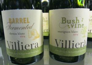
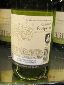
Organised by online magazine, Winemag, the inaugural Wine Label Design Awards, sponsored by Rotolabel, attracted 92 entries; these were whittled down to 14 winners, some single labels, others as part of a range, by the judges. Photos of all winning labels may be seen here The overall winner, Peter Walser’s BLANKbottle (I love the irony of the name) range, shows great imagination of his own design; I’d certainly be tempted to try the wines in the belief that they also show the quality and imagination their packaging predicts. The other gold medal winner, Stellenbosch Vineyards’ Infiniti Noble Late Harvest anticipates a more modern classic style. The label’s emphasis on texture rather than colour does seem to becoming a trend and, in this case, complements the beautiful and unusual bottle; my eye would be drawn to and pleased by both.  Information on wine labels – apart from the legal stuff – is so often meaningless and the same old blah, blah. Hats off then to Villiera, who get their environmental concerns across in an innovative and uncomplicated way. On the front label, the green theme is established via the green strip along the bottom, Villiera appearing to be growing from it; on the back label, an icon depicts one of their environmental conservation or sustainable farming projects, at the same time directing readers to a relevant story on their website. All sufficiently appealing to entice me to buy the wine, should I not know anything about Villiera or either of the above wines.
 Hopefully this year’s awards are the first of many and new trends will evolve over the years. Prettiness in a busy fashion was a feature common to many of the winners, in sharp contrast to the bolder, brightly coloured labels.
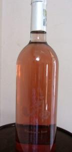 A few days later, a label of a very different character came up for discussion. A few of us were tasting Babylonstoren’s current range with winemakers Charl Coetzee and Klaas Stoffberg on the farm. As Christian Eedes, one of the people behind the Wine Label Design Awards, was part of the company, it was informative to hear his take on the ‘invisible’ label on the (very tasty) Mourvèdre Rosé (pictured here from the distance one would view it on a shelf and close up). The viognier and chenin blanc are similarly packaged. Eedes’ verdict: ‘It wouldn’t make the cut.’ A sentiment with which I agree, though both Coetzee and Stoffberg claim the bottle has attracted much attention. ‘Winelovers are intrigued by it,’ Coetzee says, maintaining there’s been no negative reaction.
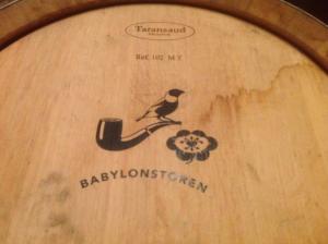
 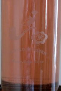 The ‘positive’ of this ‘negative’ label, as pictured on the Babylonstoren barrel, features a pipe, for the farmer; bird for nature and flower for what’s grown on the farm. On the farm’s new flagship, Nebukadnezar (the Afrikaans spelling is used to avoid problems with the more traditional Nebuchadnezzar), as well as Chardonnay and Shiraz, this logo is in blue on a white background and entirely more legible. It is stark but strangely attractive and, in my humble opinion, more likely to get shoppers to take it down from the shelf. Information on the back label is displayed in English, Afrikaans and, unusually, Chinese (Mandarin).
  If wine quality is paramount, shabby or unimaginative packaging, including the bottle itself, is as important to portray the sort of image that will attract the winelover to study the wine more closely but also buy it.
What a great read Angela! I specifically enjoyed it because I’ve just read an article about Neuroscience Marketing, which states that customers use 95% emotion, and only 5% IQ to make purchasing decisions. It makes packaging extremely important – as we know. I also agree with Christian and yourself that the Babylonstoren ‘invisible’ label won’t “make the cut”. Producers should never TRY to be clever – consumers are way too clever for that! 🙂